

As much as some of us may shrug off classic literature as only being made for the school assignments of 21st century students or as novels only created for authors to show off that they can use the most fancy prose possible while completely burying all clear plot, there’s no denying that there is a reason they’re, well, classic. And because not only are they iconic, but also with many of them being conveniently in the public domain, many publishers make their own editions of these classic books, including special collections where they take various classics and give them all their own editions with a specific cover style. So I thought, wouldn’t it be fun to rank them all?
You’ll notice almost all of these are from Penguin- after all, their website claims they are the “leading publisher of classic literature in the English-speaking world.” I’ll provide a brief description of the signature flair of each collection, then score the overall collection on a scale of 1-10, based on my opinions on the design. I won’t be assessing individual book covers, just the general theming of the collection alone. Anyway, let’s begin…
Penguin Classics (Or as I call them, the “Black Box” collection)


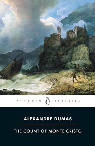
What it is: One of the most common collections of classic books, where on top there is artwork or an image, and on the bottom there is a black box with the title and author, separated by a white border with “Penguin Classics” written on it.
My opinions: These are basically the editions that everyone knows, and when you want to read a classic, chances are this is the edition you’ll end up buying if you care less about display and just want to read the book. It’s simple and probably the most basic of the editions I’ll review, but it’s iconic and one of the reasons Penguin is so well-known for classics.
Rating: 7/10
Barnes & Noble Collectible Editions:
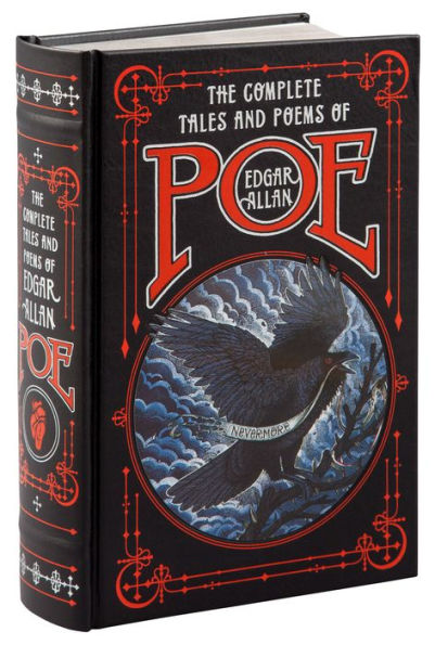
What it is: Sold exclusively at B&N, these editions often combine multiple novels/stories by an author into one massive book, and they are defined by features such as detailed, text-focused covers, ribbon bookmarks, and silver or gold sprayed edges.
My opinions: The main reason I respect these editions is that it was the only way I could get a trustworthy collection of Edgar Allan Poe’s complete works without getting some weird $2 Amazon edition. Anyway, I love the styling of the spine in these editions that makes it look like an old book, but with bright colors to modernize it, and the sprayed edges and sparkle add a nice touch, even if the covers look a bit too maximalist on some of them. But it’s definitely a display book vs. a readable one- my collection of Poe stories from them, in fact, is about 1000 pages long, heavy, and could possibly cause fatal injury if used in the wrong way. Also, the text is TINY. (Yes, I see the irony of writing “tiny” in all caps.)
Rating: 7/10
Penguin Classic Deluxe Editions:
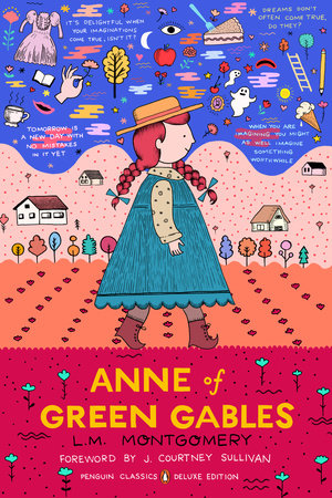


What it is: These are less “deluxe” in the way of beautiful hardcovers with sprayed edges and designed endpapers and more “deluxe” in the fact that these paperback editions use unique artwork for the covers that completely changes the vibe of what you normally expect from a classic book cover.
My opinions: I feel like classic book cover designers always go for the same general theming for classics, focusing on simple geometric imagery or motifs, but these editions are just simply the most creative ones on the market. I especially love the comic theming of The Greek Myths one (the second cover in the above slideshow) and how it pokes fun at all the scandalous things that happen in the stories, and I really hope to purchase that edition for myself one day. My favorite part is how they often look like a completely different genre or style than what the story is known for.
Rating: 9/10
Union Sq. and Co Gilded Editions (The Flower Ones)


What it is: These editions are small books with ribbon bookmarks, shiny sprayed edges, and foiled covers, with flowers being a common motif between most of them.
My opinions: My main issue with these is that I really wanted a copy of Pride and Prejudice in this edition (mostly due to the gold edges). However, the publisher doesn’t make one for P&P, but for some reason they have versions for every other Austen novel. Weird. Moving on, the main thing I like is the flower motif between all of them (the publisher makes ones without flowers, but I chose to focus on the flowers.) I’m not really sure about the bright solid colored backgrounds and amount of empty space (I think it would’ve looked best with black). And because of the small size of these, I have the feeling the text will be small too. But since I wanted one of these, I can’t really complain.
Rating: 7/10
Penguin Clothbound Editions:

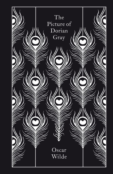

What it is: An iconic collection from Penguin, the focus is on Clothbound covers that feature repeating motifs on solid-colored backgrounds.
My opinions: These editions are so well-loved, that I’ve even seen people online copy the style to make custom covers for BookTok novels. And I understand why- not only does the hardcover clothbound design make it the perfect balance of display and actually being able to read it, but the repeated images and solid color helps make a clean, yet very stylish design. If you haven’t seen these, look for a physical copy of one in a bookstore, because these images from the online listings do not give this collection justice.
Rating: 8/10
Chiltern Classics:


What it is: Pretty much the defining thing Chiltern Publishing makes, these editions are similar to Union Sq and Co’s (small size and shiny), but instead feature geometric patterns or flowers decorating the cover on a dark background.
My opinions: It’s basically a slightly worse version of Union Sq and Co’s gilded editions, with less minimalism. The main issue I have is that there’s a lot going on in most of the designs, which isn’t exactly the vibe I would want for a classic book cover. And again, the text will probably be tiny. But points for using a black background that makes everything pop out better, even if it adds to that cluttered feeling with the contrast.
Rating: 6/10
Penguin Drop Caps Collection:
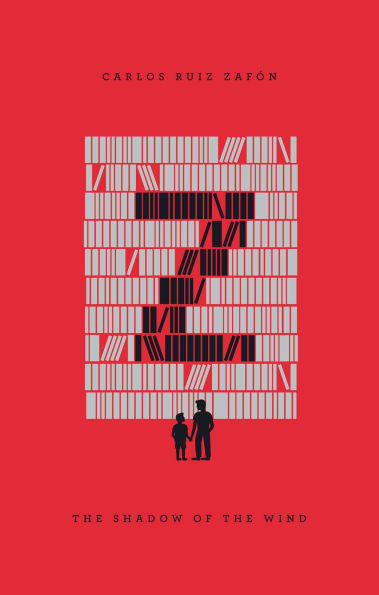

What it is: In the final collection we’ll be looking at, Penguin focuses on the initial of the author’s last name as the center image on a solid background, while stylizing it to represent central imagery or themes of the novel. There are 26 novels in total in this collection, each one focusing on a different author.
My opinions: At first, I was so confused why Penguin chose to use the author’s last initial instead of the book title for the letter, but now I respect the decision: possibly due to the rarity of books starting with “x” or “z” or other letters that would get you a bunch of points in Scrabble, they had to do the authors instead, and it led to a lot more diverse collection of titles. While most classic collections focus on the same basic picks (Pride and Prejudice, The Great Gatsby, Little Women, etc.), this collection contains some books I’ve never even heard of alongside or ones that are omitted from other classic collections alongside some of the more popular ones. Although some of the color contrast between the letters and the background is too bright at some points, I really love how each cover focuses on different imagery to make the letter stand out (I especially enjoy the one for The Shadow of the Wind by Carlos Ruiz Zafon, the second image on the above slideshow.) Overall, this is a really creative and unique collection from Penguin.
Rating: 8.5/10

You must be logged in to post a comment.