
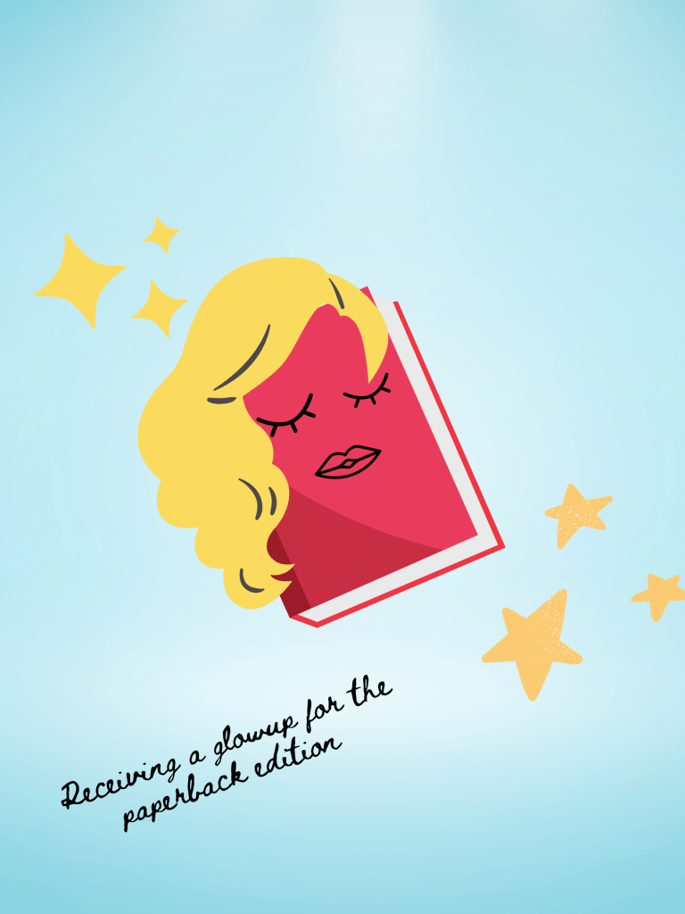
The 2020s have already resulted in a lot of changes with trends in the book world, from the rise of BookTok to the increased popularity of collector’s editions and sprayed edges. And here’s another trend I’ve seen, especially with YA books: when books previously released in hardcover get re-released in paperback, the publishers release the paperback with a different cover from the hardback- in with the old, out with the new. But the thing is? The paperback redesigns, or at least the ones I’ve seen, can either be a stunning reinvention- or very, very bad.
So that’s the goal for this article: I’ve selected a variety of YA books, a few of which I haven’t even read, that got a new cover for the paperback edition, and comparing them to the original hardback edition to see if the publishers actually made a good decision with the cover change- or if it should’ve been a huge regret. I’ll be judging based on things like color choices, art style, uniqueness, how well a cover conveys the actual plot of the book (for the ones I’ve read), and if it’s likely to draw readers in based on the cover alone.
Note: The first cover in every image set (on the left) will be the hardcover, and the second one will always be the paperback. With that note, let’s get started…
Forget Me Not (Alyson Derrick)

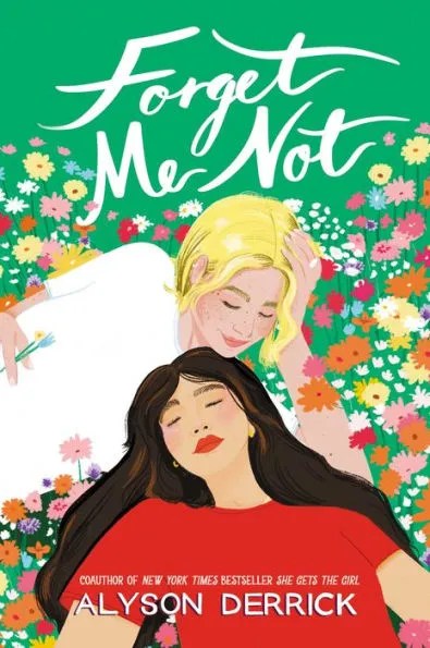
I own and have read quite a few of the books on this list, and this is one of them. Even if it’s written by the wife of Rachael Lippincott (who I’ve praised multiple times on this blog and is probably my favorite YA author at the moment), it took me forever to actually buy this book, and the updated paperback cover was most likely my main reason for purchasing it. The visible longing with the main couple paired with the flowers in the background is just so beautiful. The hardcover edition may convey the tone of the book better, and is certainly a bit thought-provoking, but it looks way more like a literary fiction title than a YA book.
Winner: PAPERBACK
Garden of the Cursed (Katy Rose Pool)
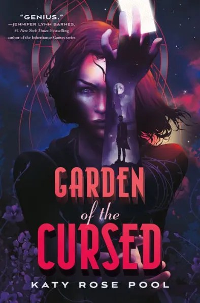
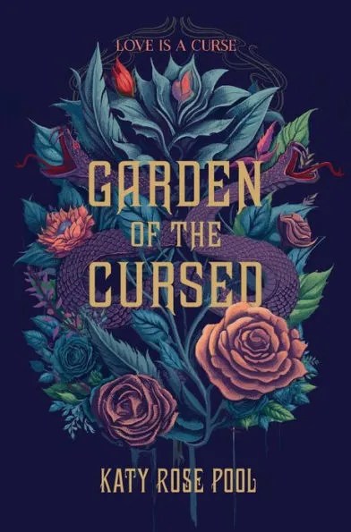
Unlike with the previous book, I actually prefer the more minimalistic cover over the one with the person on it. I think my main issue with the person is the face lighting- I don’t know why, but it just seems off for some reason and contrasts too much with the dark background. Also, if you don’t notice the hand on the bottom of the image, the the positioning of the arms will seem off. Meanwhile, the second cover really pops with the dark background.
Winner: PAPERBACK
So Let Them Burn (Kamilah Cole)

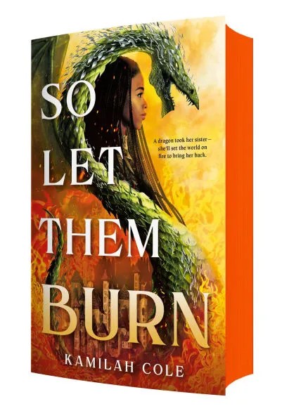
(I apologize for the awkward angle of the cover for the paperback edition, I couldn’t find an image of just the cover without it being tilted to show the edges, just because the publishers want to brag and show off how fancy the paperback is because the edges aren’t white.)
I actually reviewed this book a while back, and in the review I mentioned how stunning I thought the cover was… so even though the sprayed edges on the paperback are so stunning, I’m disappointed with the cover change. One of the reasons I became so interested in So Let Them Burn was because of the pink and purple cover, which I really wanted to display on my bookshelf. If the book was originally published with the more subdued yellow and orange cover, most likely I would’ve just passed it off as another fantasy novel without looking more into it. I will give it points for better displaying the dragon and what the main character actually looks like, though. But other than that, the original cover definitely is my favorite.
Winner: HARDCOVER
The Last Girls Standing (Jennifer Dugan)

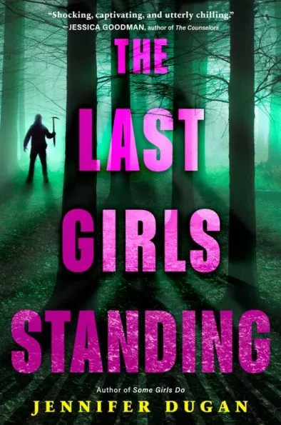
The original cover is actually a bit more creative compared to other ones on the market. The new one just looks like any old thriller cover.
Winner: HARDCOVER (In a landslide)
From Little Tokyo, with Love (Sarah Kuhn)
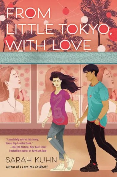
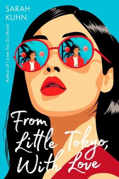
Alongside I Love You so Mochi by the same author, this was one of the first YA romances I’ve ever read (I remember being so shocked by the swearing), and 2 years after I first read it, the book released in paperback with a new cover. With the original cover, I found that the faces of the characters looked… weird. A lot of people argue against illustrated romance covers, and while normally I would disagree with them, this is one of the books where I will make an exception and support their side. So I’m happy that there’s a cover update, and the extra minimalism really helps it out. Not that I’m going to buy another copy of the book just for the cover update.
Winner: PAPERBACK
Liar’s Beach (Katie Cotugno)
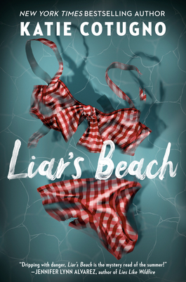

I own this one in the paperback edition but haven’t read it yet, and while I only really brought it because it was on sale, I also believe the paperback cover is definitely a step above the hardcover. It just feels awkward to put an empty swimsuit on a cover in the first place, and the dark colors seem off for some reason. Meanwhile, the vibrant colors on the paperback really stand out and better convey what the book it’s about (It’s a thriller/murder mystery, by the way.) And I’m very sorry about this, but the Taylor Swift lyric reference on the bottom of the paperback cover is definitely going to attract more teen readers.
Winner: PAPERBACK
Thieves Gambit (Kayvion Lewis)
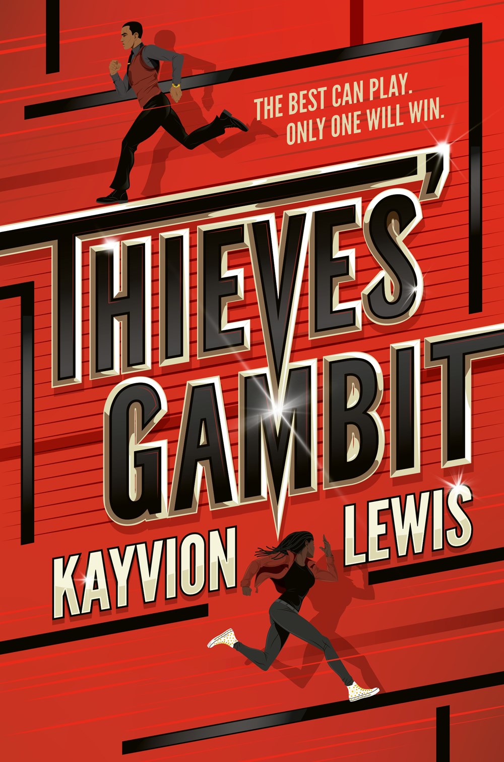
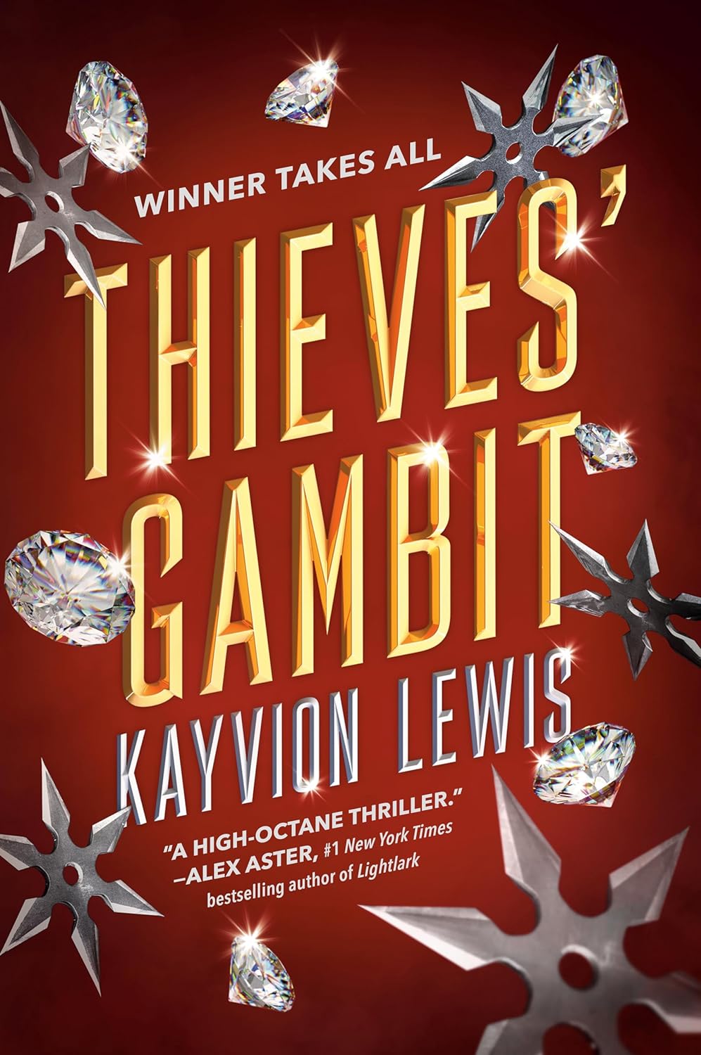
In general, I’m not a fan of covers like the paperback for this book- ones with just the title and nothing else- it just doesn’t really tell us much about the book. Meanwhile, the hardcover at least shows us the characters, and the longer “tagline” adds a little bit more intrigue than the shorter and more generic “winner takes all” on the paperback.
Winner: HARDCOVER
The Legacies (Jessica Goodman)


For most of the covers on this list, it was very easy to determine which versions had the better cover. But for this one, I actually think that both covers have their own strengths. The hardcover one is more likely to intrigue readers, especially with the large blood splatter (the guaranteed way to reveal that your thriller is going to be an intense ride.) Meanwhile, I also enjoy the more minimalistic paperback, with the purple background working well to contrast with the other elements on the cover (and there’s still a blood splatter.) But when you consider the actual plot of the book, which focuses on a group of kids in an elite high-society social club and the person who is murdered there, the hardcover better conveys the luxurious setting with the gold colors.
Winner: HARDCOVER (But it doesn’t win by much)
Conclusion:
So as you can see, there’s a huge divide in my opinions on the upgraded covers. While for many books I was proud of the update to the covers that came with the paperback editions and felt like they really improved, for others I believed the covers should’ve stayed the same as the old ones or at least have a less drastic change in the art style. But remember, these are just my personal opinions, and some people may prefer different color pallets or art styles on certain cover versions than the ones that I preferred. Most likely in a few weeks I’m going to write a full opinion article on updated paperback covers as well as the benefits and drawbacks of this mini-trend, so stay tuned!

You must be logged in to post a comment.